
Summary: Widgets come in form of “Collection Lists”, “Collection Charts”, “Collection info”, “RSS Feed” & “HTML”. They all have in common that they want to show some data or information to you. Maybe you already heard about widgets while you were creating your dashboard? In this article we want to give some more specific information about creating collection charts.
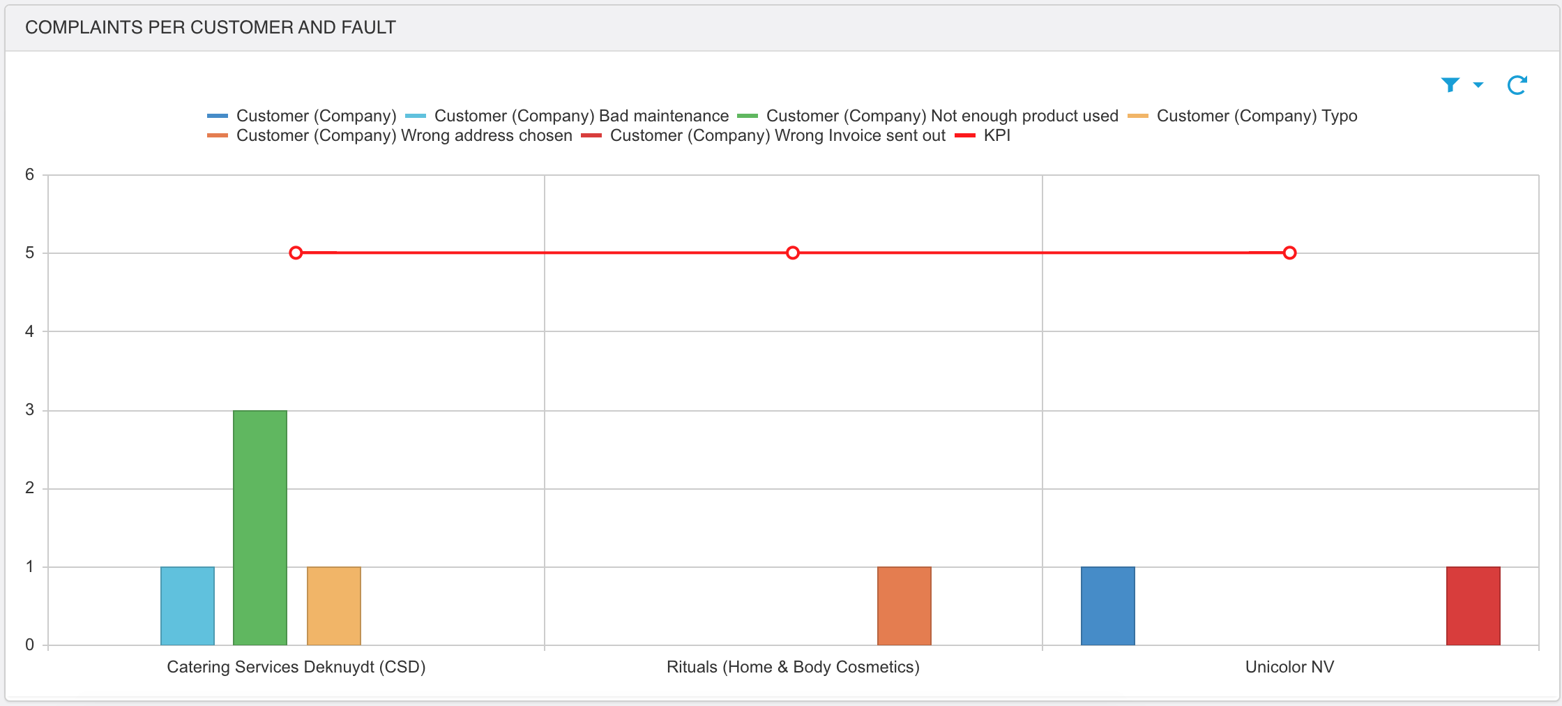
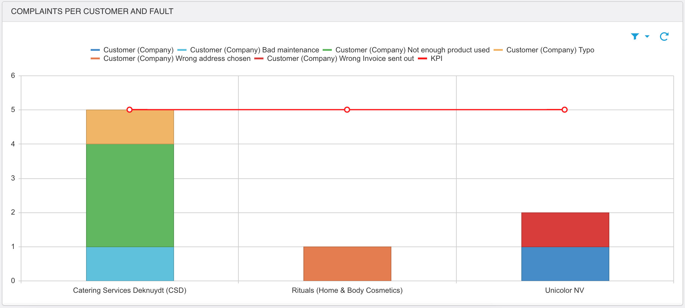
When you're viewing a collection chart you'll get a statistical overview of collection records. Let's take the example of our customer complaints.
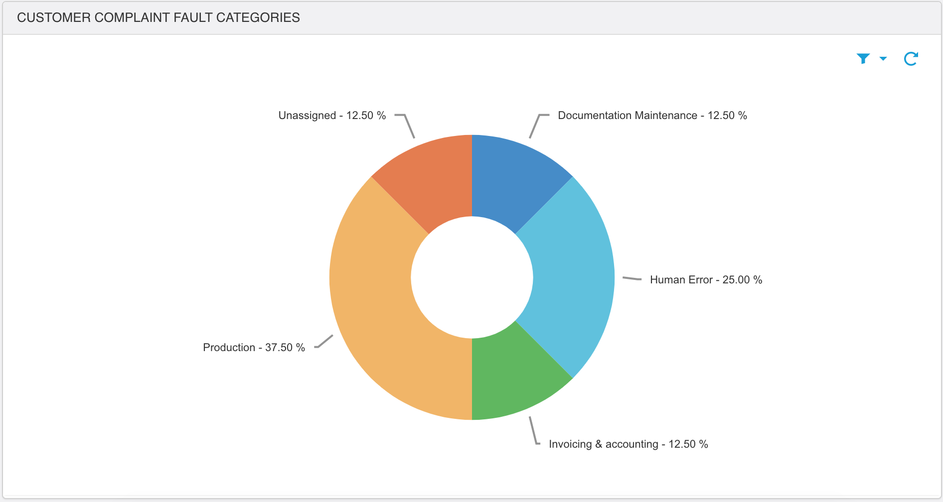
Depending on how the administrator configured it, you'll get to see a chart in form of a vertical bar chart, a horizontal bar chart, a pie chart, donut, or a line graph. In the example below you'll see an overview of the number of complaints per customer and per fault. The first screenshot shows you when the fault categories are aligned next to each other, while the second screenshot shows you the results stacked. This is something that cannot be changed by a user in the front end, it's the administrator that decides in the configuration whether the results are stacked or not. The third screenshot shows you an example of a donut chart.
The administrator can decide whether he or she wants to apply a search filter directly to the collection chart, then you will notice that the filter icon is green. If not, there is no search filter applied. The user is able to narrow down the presented result by using the search filter or if wanted and available it can use predefined filters.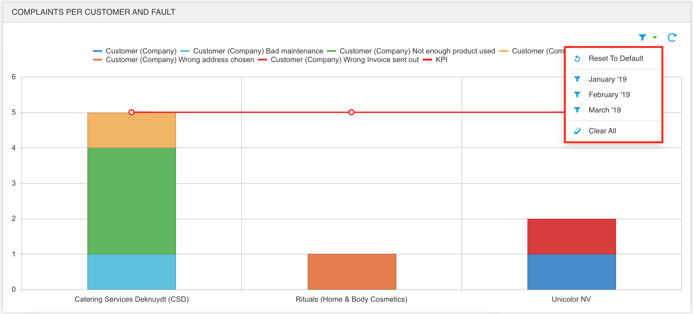
Depending on the choice of the administrator, you'll be able to see the color legend. By clicking the colours, you're able to eliminate certain categories out of the shown result. Of course you can again enable them.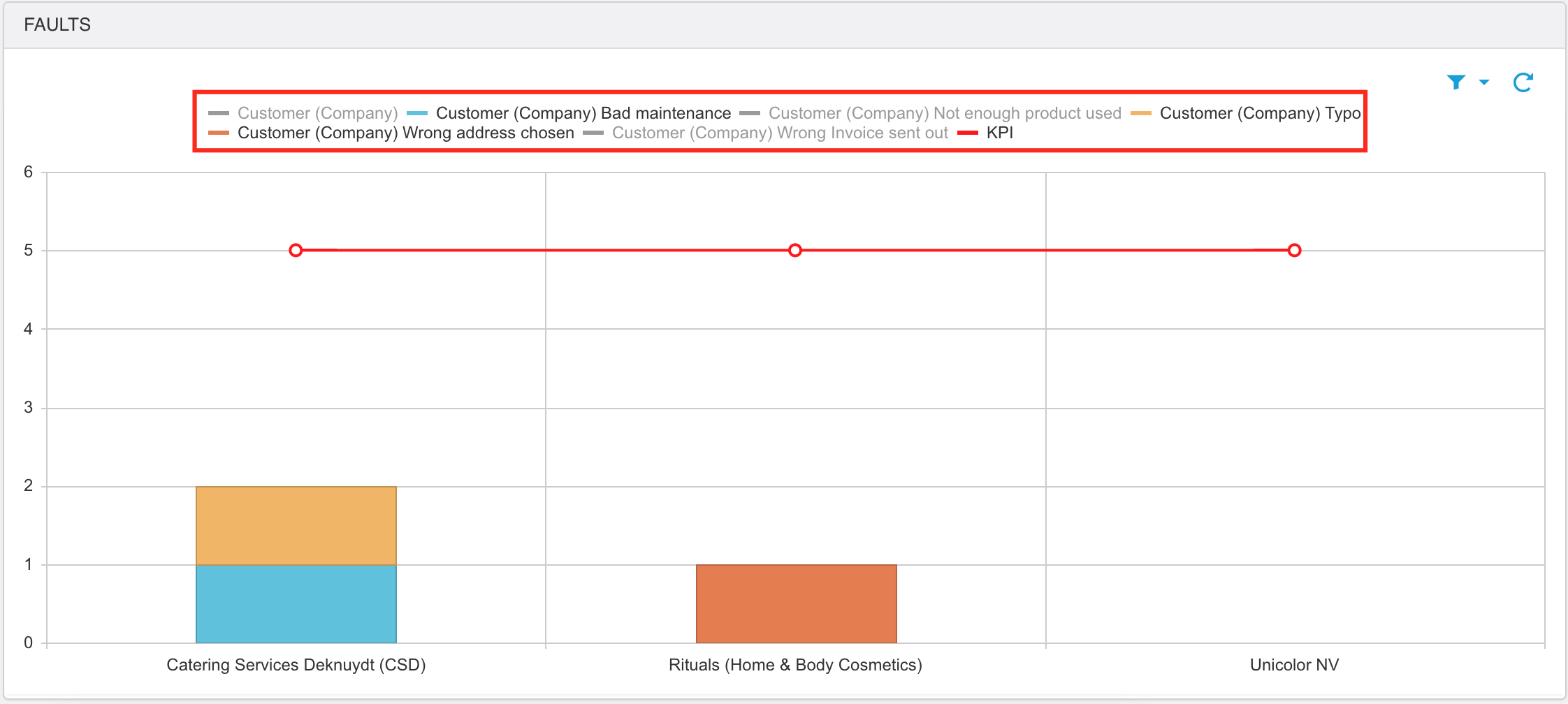
No questions yet.